Infographics
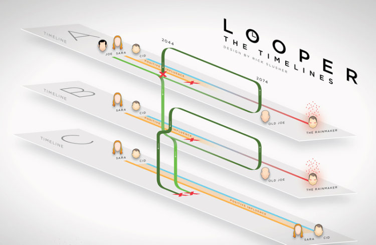
An infographic is an interpretation of data in an image. Mostly with text.
Infographics are used to explain complex matters.
Infographics are good for organizing and explaining.
People remember images better than words, especially over longer periods of time.
Resource
Canva: Good for laying out infographics and designing a whole bunch of other things (review by PC magazine). Here are their tutorials.
Datavisual makes it easy to create stunning data visualizations. Our intuitive web-based interface offers pre-designed templates that anyone can use while giving design teams the power to rev up workflow and quickly output large volumes of custom data graphics (review by Alleywatch). Sign up for tutorials at link.
Easel.ly is a website that features thousands of free infographic templates and design objects which users can customize to create and share their visual ideas online (review by Adweek). Here are their tutorials.
Infogra.am Create and publish beautiful visualizations of your data. Interactive, responsive and engaging (review by MakeUseOf). Here are their tutorials.
Lyra: Lyra is an interactive environment that enables custom visualization design without writing any code (review by Chris Pudney). Here is a tutorial by Jim Vallandingham.
Piktochart: Take your visual communication to the next level, without hiring a professional designer (review by Jason Slater). Here are their tutorials.
Plotly: Create and share charts, datasets, and dashboards online (review by Visually). Here are their tutorials.
Tableau Public is a free service that lets anyone publish interactive maps and charts to the web (using spreadsheet data). Once on the web, anyone can interact with the data, download it, or create their own visualizations of it. No programming skills are required. (Review by TrustRadius). Here are their tutorials (they’re for the paid version, which offers more features than the public version I linked to, but they’re very helpful.)
Visme is a simple tool to translate your ideas into engaging content in the form of infographics (other things listed) in order to tell better stories and translate boring data into beautiful visual content right in your browser (review by EdShelf). Here are their tutorials.